ShopDreamUp AI ArtDreamUp
Deviation Actions


Description
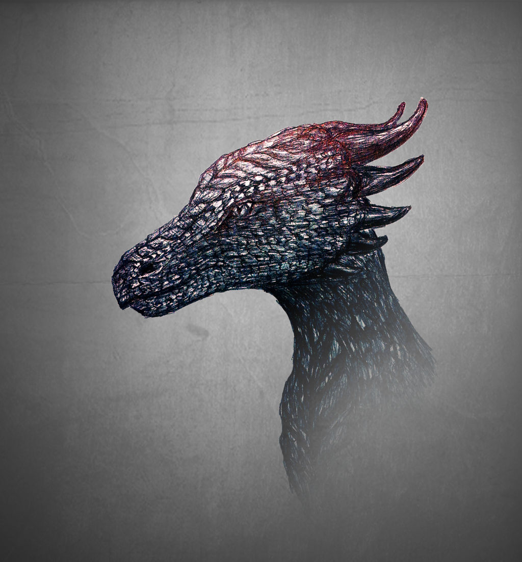
Here another version of the black dragon  (Smile)") - pen drawing edited with photoshop
- pen drawing edited with photoshop
Image size
1778x1914px 2.51 MB
© 2015 - 2024 PlushyPenguin
Comments4
Join the community to add your comment. Already a deviant? Log In
This is a critique, without paying Deviantart money to tell you it's a critique It's meant to be constructive criticism, to build your skills as an artist.
First I'll introduce myself; I'm Freeflier181, and I've drawn dragons for years. I specialize in pencil or pen and ink dragons, much like the dragon here, but I've recently begun dabbling in watercolor.
First, I'd recommend you get some professional pens They're relatively cheap and take some getting used to, but sooo worth it! Let's see, I use two brands...Faber Castell (my preference) and Precise V5. These pens have different thicknesses, and I almost exclusively use the S, or Small, pens. Or F, for Fine, depending on the brand
Getting more into detail about the shading of the dragon, I really like your scales. That's something I've been trying to perfect for some time. With all pen drawings, I've found that it's important to remember where the light is coming from. It can be difficult to keep those light areas light, and still show the shading, but worth it when you do it properly. The shading on the neck makes the head pop out more, but remember that each individual scale should be brighter in the center of the scale. I also can't help but feel that the top of the head could be a little lighter.
The shape of the dragon's head overall is pretty good. The top of the head does feel like it's warping away from you a little bit; remember perspective. You've got the basic shape of a dragon head down, so if I were you I'd start playing around with more ornamental dragon "decoration;" horns, antlers, fins, etc. Try different things until you find what you like.
As for the Photoshop element in this piece, I don't think you needed to fade away the bottom of the neck. You really did make the lighter points pop out on this one compared to the other. And if you want to mess with color, I recommend you try it all over the dragon, not just the top of its head
Oh, and I haven't even mentioned yet, I really like the eye!
Overall, this is a pretty good dragon from an up-and-coming young artist. I want to encourage you to keep drawing, look at examples of other people's work, take some art classes at school, and keep sharing your work. The support you get here will encourage you to keep going. Good luck!")
First I'll introduce myself; I'm Freeflier181, and I've drawn dragons for years. I specialize in pencil or pen and ink dragons, much like the dragon here, but I've recently begun dabbling in watercolor.
First, I'd recommend you get some professional pens
Getting more into detail about the shading of the dragon, I really like your scales. That's something I've been trying to perfect for some time. With all pen drawings, I've found that it's important to remember where the light is coming from. It can be difficult to keep those light areas light, and still show the shading, but worth it when you do it properly. The shading on the neck makes the head pop out more, but remember that each individual scale should be brighter in the center of the scale. I also can't help but feel that the top of the head could be a little lighter.
The shape of the dragon's head overall is pretty good. The top of the head does feel like it's warping away from you a little bit; remember perspective. You've got the basic shape of a dragon head down, so if I were you I'd start playing around with more ornamental dragon "decoration;" horns, antlers, fins, etc. Try different things until you find what you like.
As for the Photoshop element in this piece, I don't think you needed to fade away the bottom of the neck. You really did make the lighter points pop out on this one compared to the other. And if you want to mess with color, I recommend you try it all over the dragon, not just the top of its head
Oh, and I haven't even mentioned yet, I really like the eye!
Overall, this is a pretty good dragon from an up-and-coming young artist. I want to encourage you to keep drawing, look at examples of other people's work, take some art classes at school, and keep sharing your work. The support you get here will encourage you to keep going. Good luck!